“Explore 75 top mobile landing page examples with tips for creating high-converting, mobile-friendly pages.”
Mobile landing pages are no longer optional; they’re essential for businesses that want to stay competitive. A well-designed landing page should grab attention, provide value, and make it easy for users to take action—all in a few swipes and taps. In this post, we’ll go over 75 of the best mobile landing page examples and explain why they work so that you can apply these strategies to your site.
Each example includes an in-depth look at the design, user experience, and performance, plus actionable takeaways you can use to improve your mobile landing pages. Whether you’re selling products, generating leads, or offering services, these examples will inspire you to create mobile landing pages that convert.
Mobile Landing Page Example #1. Airbnb
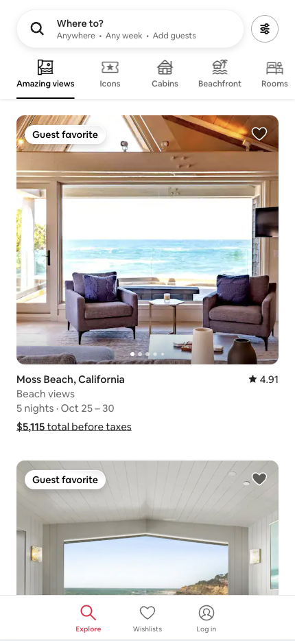
Airbnb’s mobile landing page streamlines the user experience, encouraging visitors to engage quickly without distractions. The design helps users find a place to stay with minimal effort.
Why this landing page works well:
- Minimal design: The clean layout avoids unnecessary clutter, focusing on the primary goal—booking a stay.
- Prominent CTA: The “Where to?” button is large and clear, ensuring users know how to proceed immediately.
- Use of visuals: High-quality images of popular destinations inspire users to browse.
- Intuitive navigation: The interface is intuitive, making it effortless for users to take the next step.
Mobile Landing Page Example #2. Spotify
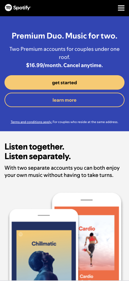
Spotify’s mobile landing page appeals to music lovers with vibrant colors and concise messaging. The page makes it easy for users to try the service without making a long-term commitment.
Why this landing page works well:
- Bold color scheme: Vibrant colors highlight key elements, particularly the CTA.
- Simple CTA: The prominently placed “get started” motivates users to act immediately.
- Minimal copy: Spotify keeps text to a minimum, letting users focus on the core offer.
- Focus on user benefits: The page highlights perks like ad-free listening and offline access to attract sign-ups.
Mobile Landing Page Example #3. Nike
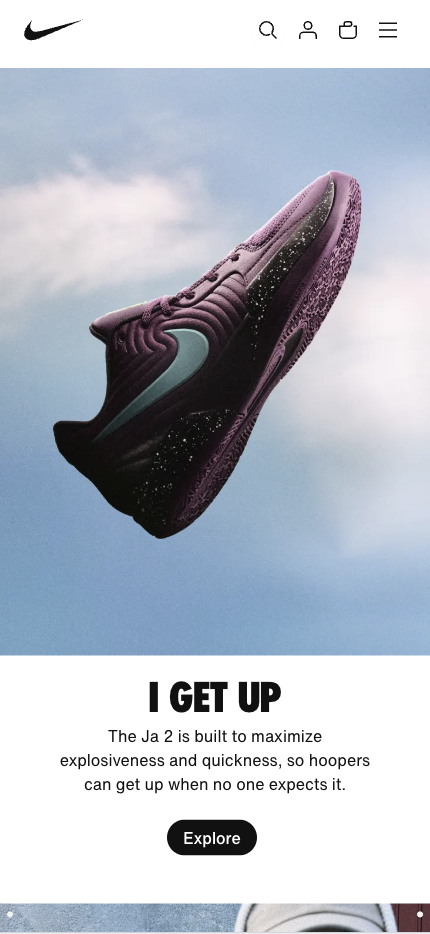
Nike’s landing page for mobile users reflects the brand’s sleek, high-performance image. The design is about the product, and visuals are vital in grabbing attention.
Why this landing page works well:
- Consistent branding: The page’s look and feel are consistent with Nike’s overall branding, reinforcing brand recognition.
- High-quality images: Large, visually appealing product shots highlight Nike’s offerings.
- Strong CTA: The bold and prominent “Explore” button appears below the compelling message “I GET UP,” making it highly effective. It is simple yet powerful, inviting users to engage with the content without committing to a purchase or sign-up. This lowers the barrier for interaction, making it easier for users to click.
- Smooth navigation: The user journey is straightforward, with no unnecessary steps that could lead to frustration.
Mobile Landing Page Example #4. Dropbox
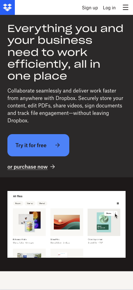
Dropbox’s landing page focuses on simplicity and clarity. It presents its core value—file storage and sharing—right from the start without overwhelming users with too much information.
Why this landing page works well:
- Minimalist design: Dropbox’s clutter-free design helps keep the focus on its primary benefit—saving and accessing files quickly.
- Clear value proposition: “Everything you and your business need to work efficiently, all in one place” quickly explains the service’s core function.
- Streamlined sign-up: A simple process removes conversion barriers, ensuring a smooth user experience.
- Mobile-friendly layout: The page loads quickly and adapts seamlessly to various screen sizes.
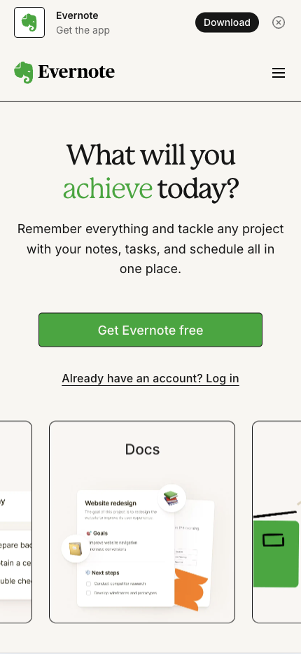
Mobile Landing Page Example #5. Evernote
Evernote’s mobile landing page appeals to users who want a productivity tool that simplifies their lives. The messaging focuses on how users can “Remember everything” with minimal effort.
Why this landing page works well:
- Straightforward messaging: Evernote clearly states its value proposition upfront, making it easy for users to understand the benefits.
- Prominent CTA: The “Get Evernote Free” button is easy to spot and invites immediate action.
- User-focused visuals: Visuals show real-life scenarios where Evernote can be helpful, helping visitors visualize its benefits.
- Mobile-optimized design: The page works seamlessly on mobile devices, offering an intuitive experience.
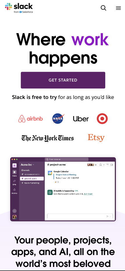
Mobile Landing Page Example #6. Slack
Slack’s mobile landing page targets busy professionals who need a quick, simple solution for team communication. The page uses concise messaging to convey its value without overloading the visitor.
Why this landing page works well:
- Minimalist approach: Slack’s simple design allows users to focus on the primary message—team collaboration.
- Bold CTA: The prominently placed “GET STARTED” encourages users to act immediately.
- Efficient use of space: Instead of focusing on one clear goal, the page avoids overwhelming visitors with too much information.
- Mobile-first design: The responsive layout ensures that users can easily navigate and interact with the page on their devices.
Mobile Landing Page Example #7. Wishpond
Wishpond’s mobile landing page showcases its marketing automation platform and guides users toward starting a free trial. It is clean, easy to navigate, and focused on conversion.

Why this landing page works well:
- User-friendly layout: The page has a clean design that guides users through the platform’s key benefits.
- Focused messaging: The copy highlights what Wishpond can do for businesses, such as generating leads, automating marketing, and more.
- Clear CTA: The prominently placed “BOOK A DEMO” makes it easy for users to engage.
- Responsive design: Wishpond optimizes its landing page for mobile, ensuring it looks great and performs well on any device.
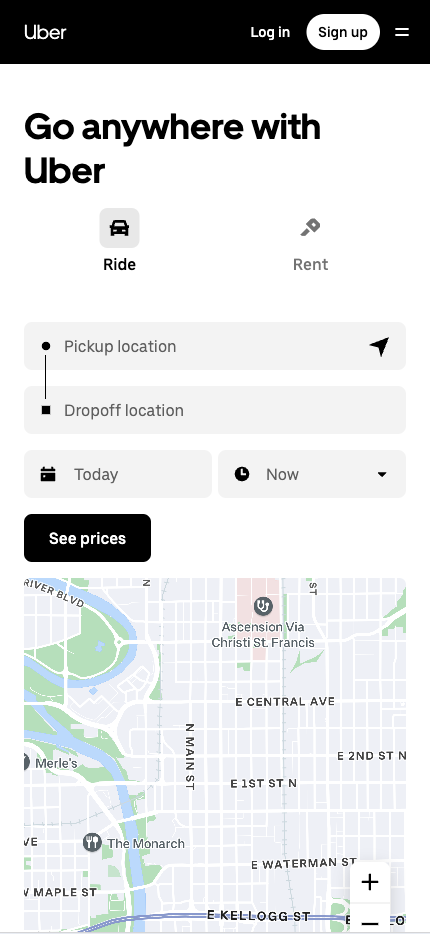
Mobile Landing Page Example #8. Uber
Uber’s landing page meets users’ immediate transportation needs. The sleek design focuses on getting users to sign up quickly and efficiently.
Why this landing page works well:
- Laser-focused value proposition: The message “Go anywhere with Uber” immediately tells users what to expect.
- Prominent CTA: The “Sign Up” button is bold and directs users to take the next step.
- Concise layout: The page avoids unnecessary details, focusing only on what the user needs to know to use the service.
- Efficient use of space: Uber’s landing page maximizes mobile screen space without feeling crowded.
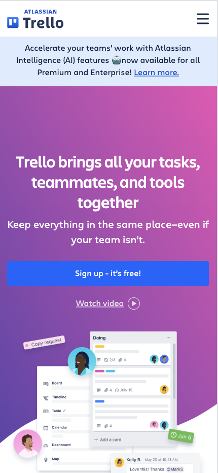
Mobile Landing Page Example #9. Trello
Trello’s mobile landing page showcases simplicity in design. The page emphasizes the product’s core function—organizing tasks—and encourages users to get started with minimal effort.
Why this landing page works well:
- Simple design: Trello keeps things straightforward, focusing on its core value proposition—team and task management.
- Clear CTA: “Sign up – it’s free!” is simple and direct, inviting users to join without hesitation.
- Minimal distractions: The page is accessible from unnecessary elements, making it easy for users to focus on the primary action.
- Responsive layout: Trello’s page adapts well to mobile screens, providing a seamless user experience.
Mobile Landing Page Example #10. Shopify
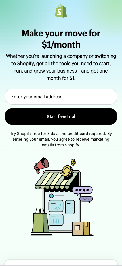
Shopify’s mobile landing page converts entrepreneurs looking to start their online stores. It communicates the platform’s value and encourages users to start their free trial.
Why this landing page works well:
- Strong CTA: “Start free trial” is the first thing users see, driving them to take immediate action.
- Clear value statement: Shopify emphasizes how easy it is to create an online store, addressing one of users’ main concerns.
- User-friendly design: The layout optimizes readability and interaction on smaller screens.
- Trust-building elements: Shopify includes testimonials and partnerships to build credibility and encourage sign-ups.
Mobile Landing Page Example #11. Mailchimp
Mailchimp’s mobile landing page captures the brand’s playful nature while focusing on converting visitors. It encourages users to sign up and start using their email marketing platform.

Why this landing page works well:
- Brand consistency: The design stays true to Mailchimp’s creative branding, making the page visually engaging.
- Bold CTA: “Start Free Trial” stands out, directing users to the next step with a low-commitment offer.
- Effective use of space: The page feels open and uncluttered, guiding the user’s attention to the CTA.
- Mobile-friendly layout: Mailchimp’s landing page allows quick and easy mobile device navigation.
Mobile Landing Page Example #12. Netflix
Netflix’s landing page uses a straightforward approach to entice users to sign up for their free trial. The design is clean, and the messaging is clear—users know exactly what they’re getting.

Why this landing page works well:
- Simple CTA: The prominent “Get Started” guides users to the next step.
- Minimal distractions: The design avoids unnecessary elements, focusing on converting visitors.
- Mobile-optimized design: The page looks great on all screen sizes, ensuring a consistent user experience across devices.
Mobile Landing Page Example #13. Amazon
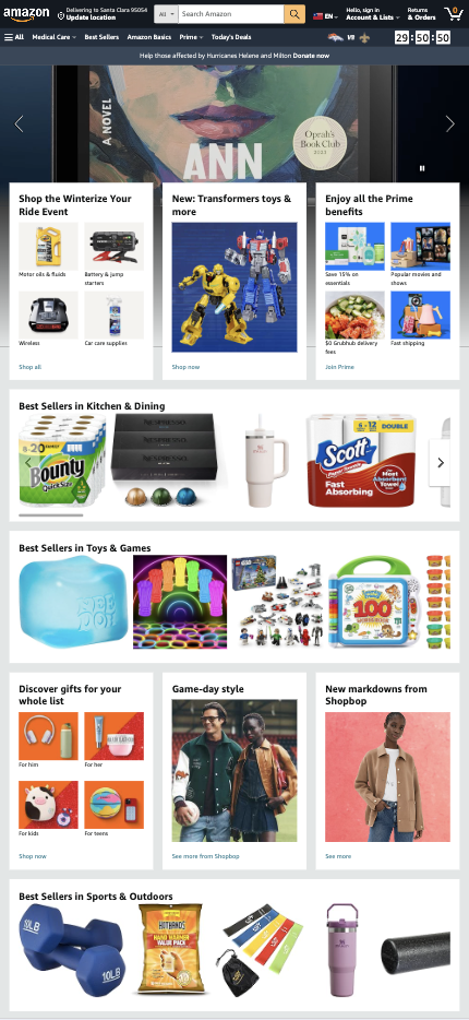
Amazon’s mobile landing page showcases products and drives purchases. The design makes it easy for users to browse and buy items on the go.
Why this landing page works well:
- High-quality images: Product visuals are sharp and appealing, allowing users to explore more.
- Strong CTAs: The “Shop Now” and “See more” buttons are easy to find and encourage quick conversions.
- Easy navigation: The layout allows users to scroll and browse products without feeling overwhelmed.
- Trust signals: Amazon includes user reviews and ratings to help guide purchasing decisions.
Mobile Landing Page Example #14. Wix
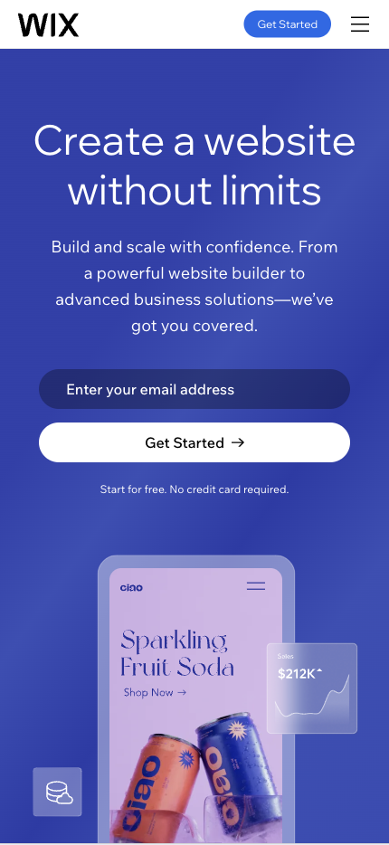
Wix’s mobile landing page targets users who want to create websites quickly and easily. The design is simple, and the CTA invites users to start building immediately.
Why this landing page works well:
- Simple, actionable CTA: The direct “Get Started” encourages users to create their websites.
- User-friendly design: The page is easy to navigate and focuses on getting users to take action quickly.
- Visual appeal: Wix uses strong visuals to showcase their website templates, inspiring users to explore more.
- Mobile optimization: The design adapts perfectly to mobile devices, ensuring a smooth user experience.
Mobile Landing Page Example #15. Asana
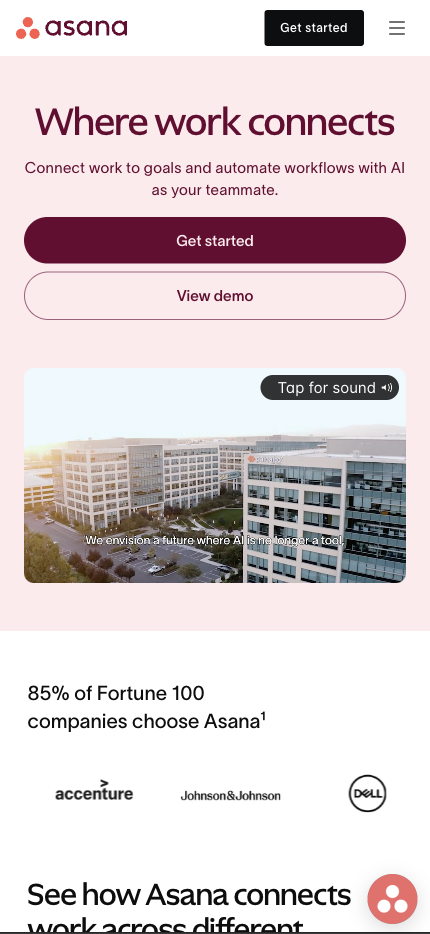
Asana’s mobile landing page highlights its project management tool simply and visually appealingly. The design focuses on driving users to sign up for free and use the tool.
Why this landing page works well:
- Bold use of color: Bright colors help crucial elements like the CTA stand out, guiding users to take action.
- Strong CTA: The direct and actionable “Get Started” encourages users to engage immediately.
- Minimal text: The page avoids lengthy copy, focusing on visuals and short, impactful messaging.
- Mobile-optimized layout: Asana’s page is responsive, ensuring it looks great on all screen sizes.
Mobile Landing Page Example #16. Canva
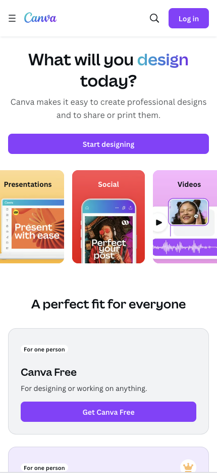
Canva’s mobile landing page is perfect for users who want to design easily and quickly. Its simple interface highlights the product’s ease of use for anyone wanting to create visual content.
Why this landing page works well:
- User-friendly design: The page is clean, simple, and intuitive, allowing users to understand how Canva can help them design quickly.
- Visual storytelling: Canva effectively uses images of the tool in action, showing users what they can create.
- Clear CTA: The simple and direct “Start designing” urges users to start immediately.
- Mobile-optimized experience: The layout enables quick interaction, making it easy for users to dive into developing on the go.
Mobile Landing Page Example #17. Squarespace
Squarespace’s mobile landing page appeals to creatives looking to build beautiful websites. It combines imagery with minimal text to highlight its design-driven approach.

Why this landing page works well:
- Showcase of templates: The page uses visuals of stunning website templates to attract users.
- Bold, direct CTA: “Get Started” stands out and encourages users to begin building their site.
- Minimal text: The copy is concise, focusing on the product’s core benefits without overwhelming visitors.
- Fast load time: The page loads quickly, reducing the risk of user abandonment due to slow speed.
Mobile Landing Page Example #18. Zoom
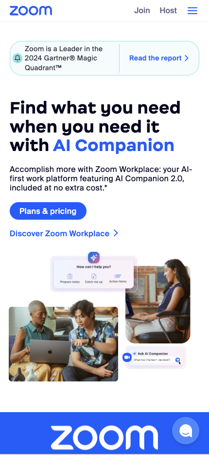
Zoom’s mobile landing page focuses on its main selling point—easy, reliable video conferencing. The page encourages users to sign up or download the app without fuss.
Why this landing page works well:
- Clear focus: The messaging focuses on what Zoom does best—“
Find what you need when you need it with AI Companion .” - Strong CTA: “Plans & pricing” is bold and visible, guiding users to the next step.
- Minimal distractions: The page only includes essential information, making it easy for users to take action.
- Mobile-first design: The layout optimizes navigation for smaller screens, ensuring ease of use on mobile devices.
Mobile Landing Page Example #19. Basecamp
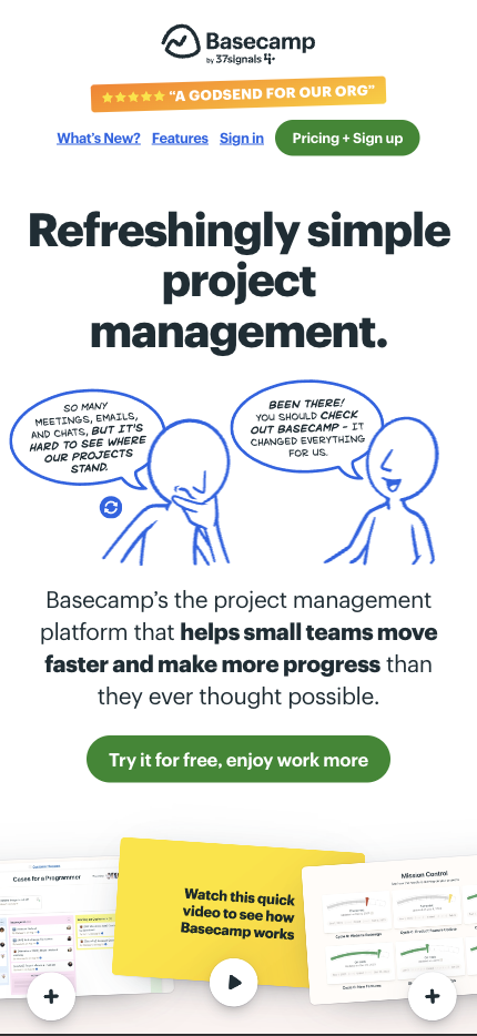
Basecamp’s mobile landing page targets teams needing a project management tool. It simplifies the message and focuses on helping users organize their projects immediately.
Why this landing page works well:
- Straightforward messaging: The copy focuses on the benefits of using Basecamp for team collaboration.
- Bold CTA: “Try it for free, enjoy work more” encourages users to take immediate action with no upfront cost.
- Minimal design: The page avoids clutter, making it easy for users to digest the information.
- Optimized for mobile: The responsive layout ensures the page functions smoothly on any device.
Mobile Landing Page Example #20. Hulu
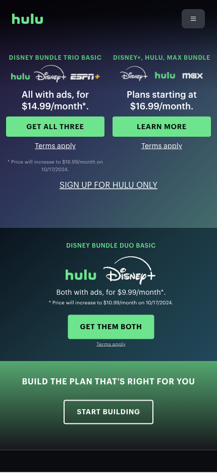
Hulu’s mobile landing page emphasizes its free trial offer, making it clear and easy for users to sign up and start watching their favorite shows.
Why this landing page works well:
- Urgency-driven CTA: “GET THEM BOTH” creates a sense of urgency and encourages immediate action.
- Simple, effective design: The page is visually clean, focusing entirely on getting users to sign up.
- Clear value proposition: Hulu highlights its vast content library, so signing up is a no-brainer.
- Mobile-first layout: The page ensures a seamless mobile experience by eliminating unnecessary elements that could slow it down.
Mobile Landing Page Example #21. LinkedIn
LinkedIn’s mobile landing page targets professionals looking to build their network. The page is simple and focuses on the benefits of joining LinkedIn.

Why this landing page works well:
- Professional focus: The copy speaks directly to professionals, highlighting the value of expanding their network.
- Bold CTA: “Join now” is easy to spot and invites users to take immediate action.
- Concise copy: LinkedIn keeps the text brief, focusing on the main benefits without overwhelming the user.
- Mobile-optimized experience: The layout is designed for easy navigation, ensuring a smooth sign-up process.
Mobile Landing Page Example #22. Adobe
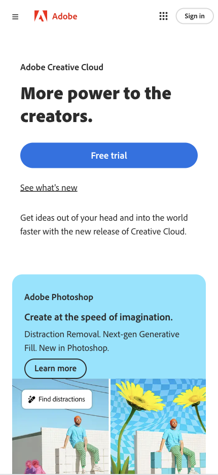
Adobe’s mobile landing page encourages users to try its creative software. The page emphasizes a free trial and highlights the key benefits of using Adobe’s suite of tools.
Why this landing page works well:
- Focus on free trial: The CTA “Free trial” is prominently placed, encouraging users to test the software risk-free.
- Strong visuals: Adobe uses images of its products in action, showcasing the capabilities of its tools.
- Concise copy: The page avoids overwhelming users with too much information, focusing on the main benefits.
- Mobile-optimized layout: The page is responsive and loads quickly, providing a smooth experience for mobile users.
Mobile Landing Page Example #23. Pinterest
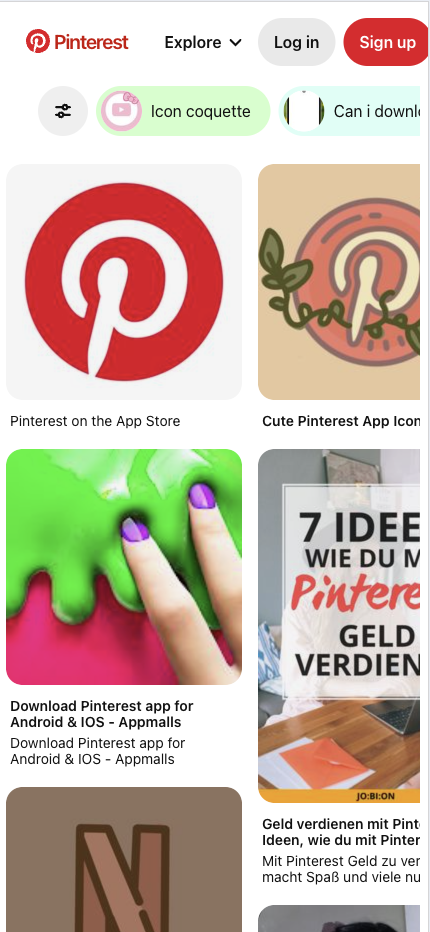
Pinterest’s mobile landing page makes it easy for users to get started by highlighting the platform’s benefits and simplifying the sign-up process.
Why this landing page works well:
- Simple sign-up process: Pinterest reduces friction by allowing users to sign up with just a few clicks.
- Visual appeal: The page uses images to show what users can discover on Pinterest, inspiring them to join.
- Strong CTA: “Sign up” is bold and directs users to act immediately.
- Optimized for mobile: The design is user-friendly and responsive, ensuring a seamless experience on smaller screens.
Mobile Landing Page Example #24. Google Ads
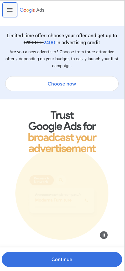
Google Ads’ mobile landing page helps businesses grow through paid advertising. It encourages users to start advertising with Google quickly.
Why this landing page works well:
- Clear value proposition: The page highlights the potential for business growth through Google Ads.
- Direct CTA: “Choose now” is easy to spot and pushes users to take immediate action.
- Minimal distractions: The design is clean, with no unnecessary elements to distract users from the primary goal.
- Mobile-friendly layout: The page loads quickly and is easy to navigate on mobile, ensuring a smooth user experience.
Mobile Landing Page Example #25. HubSpot
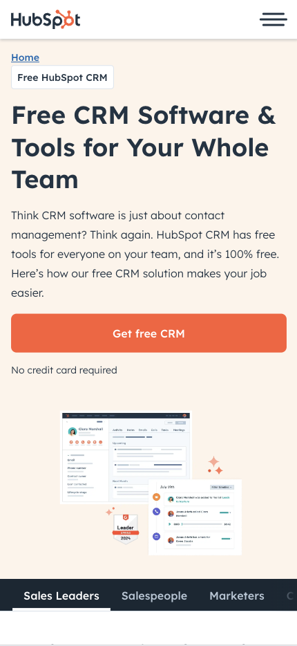
HubSpot’s mobile landing page is focused on converting visitors into users of its CRM software. The page is simple, with a strong focus on driving sign-ups.
Why this landing page works well:
- Clear focus: The messaging is centered around HubSpot’s CRM, making it easy for users to understand what’s being offered.
- Bold CTA: “Get free CRM” encourages users to try the software without hesitation.
- Minimal design: The page is clean and free of distractions, ensuring that users can focus on the CTA.
- Mobile-optimized experience: The layout is responsive and designed for mobile users, making it easy to navigate.
Mobile Landing Page Example #26. Grammarly
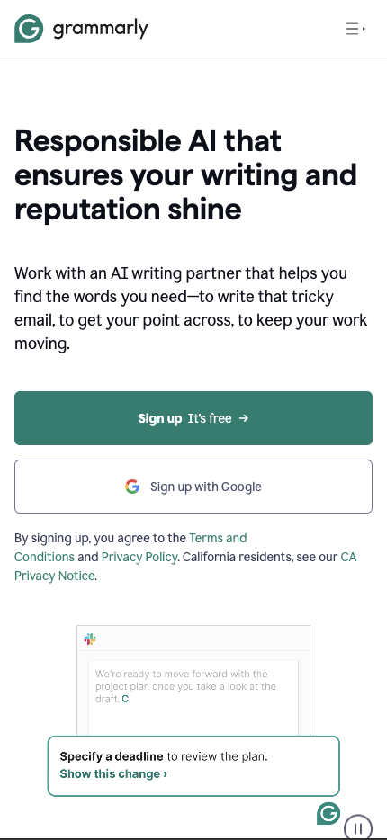
Grammarly’s mobile landing page encourages users to sign up for their writing assistant tool with a clear focus on how the tool can improve their writing.
Why this landing page works well:
- Clear value proposition: The page highlights the main benefits of using Grammarly—improving writing and avoiding mistakes.
- Strong CTA: “Sign up It’s free” is bold and easy to find, encouraging users to take action.
- Visual examples: The page shows how Grammarly can improve writing, helping users understand the tool’s value.
- Optimized for mobile: The page is responsive and loads quickly, providing a seamless experience for mobile users.
Mobile Landing Page Example #27. FreshBooks
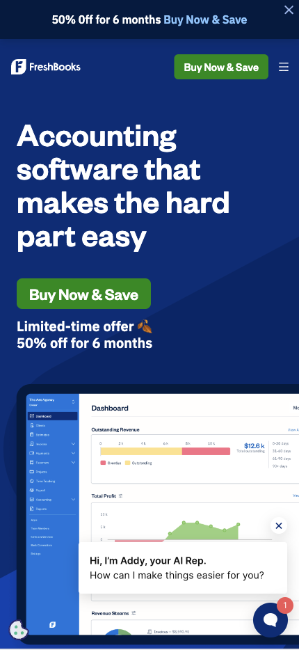
FreshBooks’ mobile landing page promotes its cloud-based accounting software and highlights its potential for making managing finances more accessible for small business owners.
Why this landing page works well:
- Strong value proposition: The page focuses on how FreshBooks can simplify accounting for business owners.
- Bold CTA: “Buy Now & Save” is prominently placed and encourages users to act immediately.
- Visual appeal: FreshBooks uses images of its software to show how it works, making it easy for users to understand its benefits.
- Mobile-first design: The page is designed for mobile users, ensuring a smooth experience on any device.
Mobile Landing Page Example #28. Eventbrite
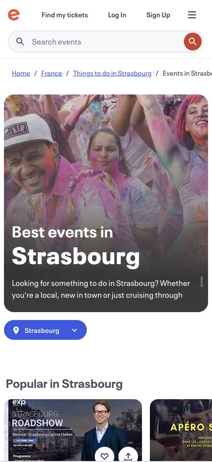
Eventbrite’s mobile landing page is geared toward event creators and attendees, making it easy for users to find or create events quickly.
Why this landing page works well:
- Clear focus: The page highlights Eventbrite’s main functions—finding and creating events—making it easy for users to engage.
- Strong CTAs: “Find my tickets” and “Sign Up” buttons are bold and easy to spot, directing users to take action.
- Minimal design: The page avoids unnecessary distractions, focusing only on the core functions of the platform.
- Mobile optimization: The layout is responsive and designed for quick navigation on mobile devices.
Mobile Landing Page Example #29. SurveyMonkey
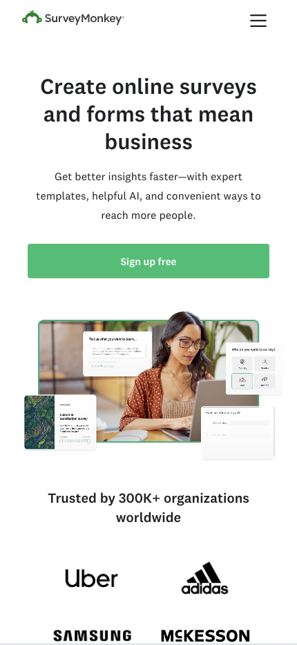
SurveyMonkey’s mobile landing page is designed to help users create surveys quickly and easily. The page highlights the platform’s benefits and simplifies the sign-up process.
Why this landing page works well:
- Strong value proposition: The page emphasizes how SurveyMonkey can help users gather insights through surveys.
- Clear CTA: “Sign up free” is bold and directs users to act immediately.
- Minimal distractions: The design is clean, with no unnecessary elements to distract users from the primary goal.
- Optimized for mobile: The layout is responsive and easy to navigate, ensuring a seamless user experience.
Mobile Landing Page Example #30. Buffer
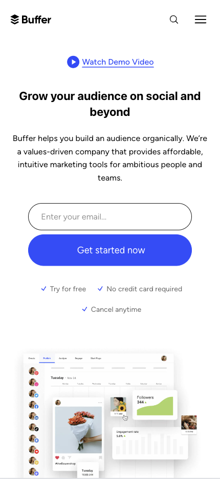
Buffer’s mobile landing page focuses on its social media management tool, encouraging users to sign up and manage their accounts efficiently.
Why this landing page works well:
- Clear focus: The messaging is centered around Buffer’s ability to simplify social media management.
- Bold CTA: “Get Started Now” encourages users to take immediate action and use the tool.
- Minimal design: The page is clean and free of distractions, ensuring that users can focus on the CTA.
- Mobile-optimized layout: The page is responsive and designed for mobile users, making it easy to navigate.
Mobile Landing Page Example #31. Hootsuite
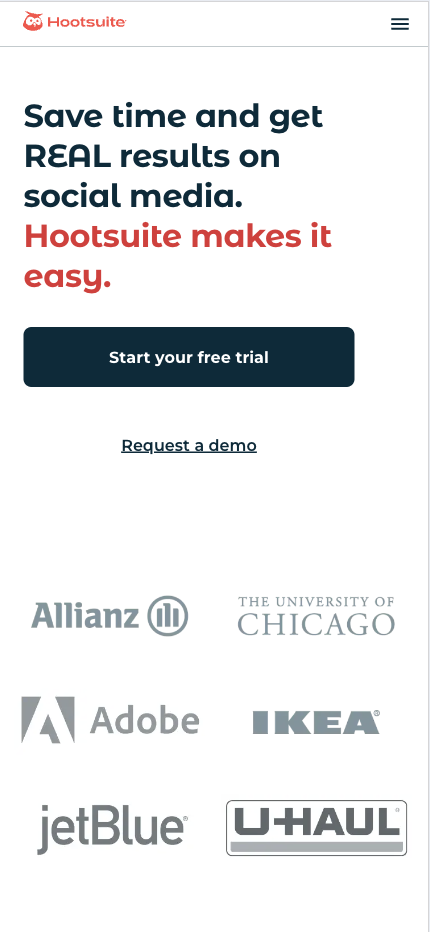
Hootsuite’s mobile landing page is designed for users who want to manage their social media accounts effectively. The page focuses on the core benefits of using Hootsuite, making it easy for visitors to see the value.
Why this landing page works well:
- Focused messaging: The page communicates how Hootsuite simplifies business social media management.
- Strong CTA: “Start Your Free Trial” is bold and encourages users to test the platform before committing.
- Minimal design: The page avoids unnecessary information, focusing on the key benefits.
- Mobile-friendly layout: The page adapts well to mobile devices, providing a seamless experience for users.
Mobile Landing Page Example #32. Blue Apron
Blue Apron’s mobile landing page encourages visitors to sign up for its meal delivery service. The design uses a combination of visuals and offers to encourage conversions.

Why this landing page works well:
- Enticing offer: The page offers a discount on the first order, which helps attract new customers.
- Clear CTA: “REDEEM OFFER” is prominently displayed and creates a sense of urgency.
- Visual appeal: High-quality images of meals inspire users to take action.
- Mobile-optimized design: The layout is responsive and fast-loading, ensuring a smooth user experience.
Mobile Landing Page Example #33. Dropbox Paper
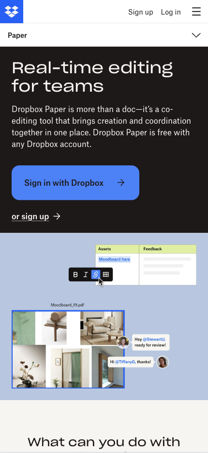
Dropbox Paper’s mobile landing page highlights the simplicity of its collaboration tool. The minimalistic design focuses on getting users to try the platform for free.
Why this landing page works well:
- Simple, clear messaging: The page emphasizes Dropbox Paper’s ease of use and collaborative features.
- Strong CTA: “Sign in with Dropbox” is straightforward and encourages immediate engagement.
- Minimal distractions: The design focuses solely on the core benefits without unnecessary elements.
- Mobile-optimized layout: The page is designed for easy navigation on mobile devices, ensuring a smooth user experience.
Mobile Landing Page Example #34. Headspace
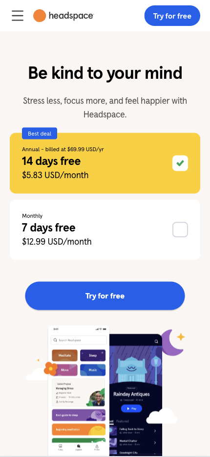
Headspace’s mobile landing page is designed to attract users interested in mindfulness and meditation. The page uses visuals and a clear value proposition to encourage users to sign up.
Why this landing page works well:
- Visual storytelling: The page uses images of the app in action, showing how it can help users reduce stress.
- Strong CTA: “Try for free” is bold and invites users to try the app for free.
- Concise messaging: The minimal copy focuses on the app’s main benefits.
- Mobile-optimized design: The layout is designed for mobile, making it easy for users to navigate and sign up.
Mobile Landing Page Example #35. Zendesk
Zendesk’s mobile landing page emphasizes the simplicity of its customer support platform. The clean design encourages users to sign up for a free trial.

Why this landing page works well:
- Clear focus: The page highlights the core benefits of using Zendesk’s support platform.
- Strong CTA: “Start Free Trial” is bold and encourages users to test the platform without commitment.
- Minimal design: The page avoids clutter, making it easy for users to focus on the CTA.
- Mobile-optimized layout: The page is responsive and adapts seamlessly to different screen sizes.
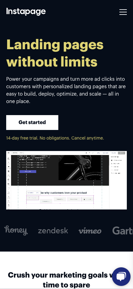
Mobile Landing Page Example #36. Instapage
Instapage’s mobile landing page highlights the platform’s ability to create landing pages quickly and easily. The page is designed to get users to start a free trial.
Why this landing page works well:
- Clear value proposition: The page emphasizes how Instapage can help users create high-converting landing pages.
- Bold CTA: “Get started” is prominently displayed, encouraging users to take action.
- Simple design: The layout is clean and focused, without unnecessary distractions.
- Mobile-optimized experience: The page is designed for mobile users, ensuring a smooth, responsive experience.
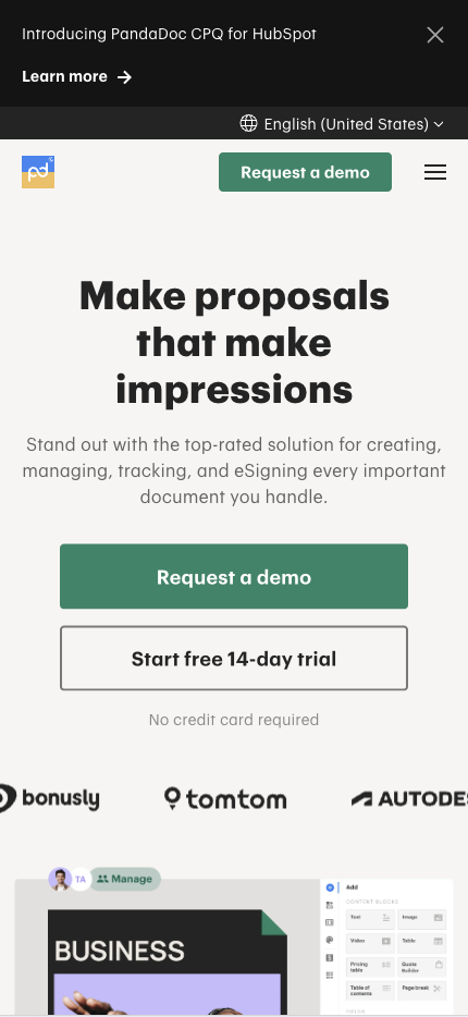
Mobile Landing Page Example #37. PandaDoc
PandaDoc’s mobile landing page focuses on its document creation and signing platform. The page highlights the key benefits and encourages users to start a free trial.
Why this landing page works well:
- Strong value proposition: The page emphasizes how PandaDoc simplifies document creation and signing.
- Bold CTA: “Start free 14-day trial” is prominently displayed, guiding users to act immediately.
- Minimal design: The page focuses on the core features without unnecessary distractions.
- Mobile-friendly layout: The page is responsive and designed for mobile users, ensuring a seamless experience.
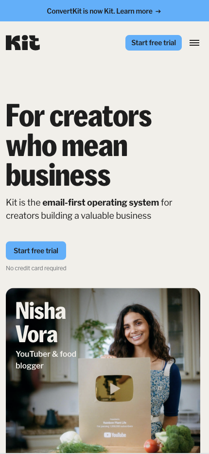
Mobile Landing Page Example #38. ConvertKit
ConvertKit’s mobile landing page is designed for creators who want to grow their audience through email marketing. The page highlights the platform’s features and encourages users to start for free.
Why this landing page works well:
- Clear value proposition: The page highlights how ConvertKit can help creators build their audience.
- Strong CTA: “Start free trial” is prominently displayed, encouraging users to sign up.
- Minimal design: The page avoids clutter, focusing on the platform’s core benefits.
- Mobile-optimized layout: The page is designed for mobile devices, providing a seamless experience for users.
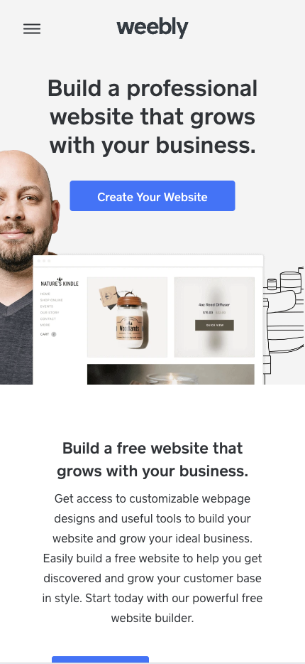
Mobile Landing Page Example #39. Weebly
Weebly’s mobile landing page is simple and emphasizes the platform’s ease of use. It helps users create websites quickly and easily.
Why this landing page works well:
- Strong value proposition: The page highlights how Weebly makes it easy to create a website, even for beginners.
- Bold CTA: “Create Your Website” is prominently displayed, encouraging users to start immediately.
- Visual appeal: The page uses images of website templates to inspire users.
- Mobile-friendly layout: The page is responsive and adapts well to mobile devices.
Mobile Landing Page Example #40. Gusto
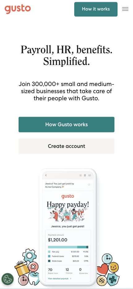
Gusto’s mobile landing page highlights the benefits of its payroll and HR platform for small businesses. The page is designed for users to sign up for a free trial.
Why this landing page works well:
- Clear value proposition: The page focuses on how Gusto simplifies payroll and HR for small businesses.
- Bold CTA: The prominently displayed “Create account” guides users to act immediately.
- Minimal distractions: The design is clean and focused, ensuring users can easily find the CTA.
- Mobile-optimized layout: The page provides a seamless experience for mobile users on smaller screens.
Mobile Landing Page Example #41. Toggl
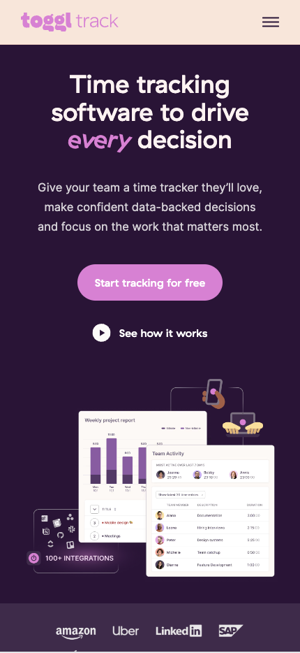
Toggl’s mobile landing page focuses on its time-tracking tool, with a simple design emphasizing ease of use. The page encourages users to try the platform for free.
Why this landing page works well:
- Strong value proposition: The page highlights how Toggl simplifies time tracking for businesses and freelancers.
- Bold CTA: The prominently displayed “Start tracking for free” encourages users to begin a free trial.
- Minimal design: The page is clean, with a focus on the key benefits of the platform.
- Mobile-friendly layout: The page ensures a smooth user experience on mobile devices.
Mobile Landing Page Example #42. Ahrefs
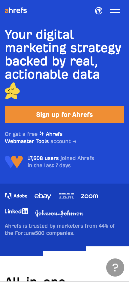
Ahrefs’ mobile landing page attracts users interested in SEO and digital marketing tools. The page highlights the platform’s key benefits and encourages users to start a free trial.
Why this landing page works well:
- Clear value proposition: The page emphasizes how Ahrefs can help users improve their SEO and marketing efforts.
- Bold CTA: The prominently displayed “Sign up for Ahrefs” encourages users to take action.
- Minimal distractions: The clean design focuses on the platform’s core benefits.
- Mobile-optimized layout: The page is responsive and adapts well to mobile devices.
Mobile Landing Page Example #43. Zapier
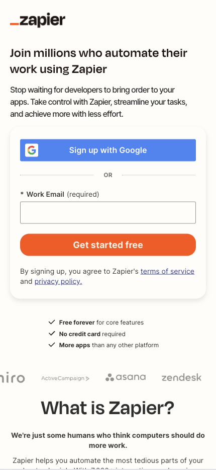
Zapier’s mobile landing page highlights how the platform can help users automate tasks between different apps. The page is simple and focuses on getting users to sign up for a free trial.
Why this landing page works well:
- Strong value proposition: The page emphasizes how Zapier simplifies business task automation.
- Bold CTA: “Get started free” is prominently displayed, encouraging users to take immediate action.
- Minimal design: The page avoids unnecessary distractions, keeping the focus on the CTA.
- Mobile-friendly layout: The page is designed for mobile users, ensuring a seamless experience.
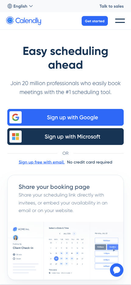
Mobile Landing Page Example #44. Calendly
Calendly’s mobile landing page focuses on simplifying scheduling for individuals and businesses. The page is designed for users to sign up for a free trial.
Why this landing page works well:
- Clear value proposition: The page highlights how Calendly makes scheduling easy and efficient.
- Bold CTA: “Sign up free with email” is prominently displayed, encouraging users to start using the platform.
- Minimal distractions: The design is clean, with a focus on the key benefits of the platform.
- Mobile-optimized layout: The page is designed for mobile devices, providing a seamless user experience.
Mobile Landing Page Example #45. Toptal
Toptal’s mobile landing page is designed to attract businesses looking for top freelance talent. The page emphasizes the quality of the talent pool and encourages users to sign up.

Why this landing page works well:
- Strong value proposition: The page highlights how Toptal connects businesses with top freelancers.
- Bold CTA: “Hire Top Talent” is prominently displayed, encouraging businesses to take action.
- Visual appeal: The page uses images of freelancers and businesses to build trust.
- Mobile-friendly layout: The page is responsive and designed for mobile users.
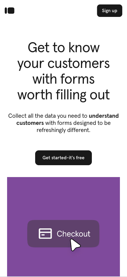
Mobile Landing Page Example #46. Typeform
Typeform’s mobile landing page encourages users to sign up for its form-building platform and highlights its tools’ simplicity and flexibility.
Why this landing page works well:
- Strong value proposition: The page emphasizes how Typeform makes it easy to create beautiful forms.
- Bold CTA: “Get started-it’s free” is prominently displayed, encouraging users to start using the platform.
- Minimal design: The page avoids distractions, focusing on the platform’s key benefits.
- Mobile-optimized layout: The page is designed for mobile devices, ensuring a seamless user experience.
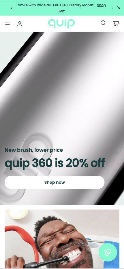
Mobile Landing Page Example #47. Quip
Quip’s mobile landing page is designed to attract users who want a simple, collaborative document-editing tool. The page highlights the key benefits of using Quip and encourages users to sign up.
Why this landing page works well:
- Clear value proposition: The page emphasizes how Quip simplifies collaboration for teams.
- Bold CTA: “Shop now” is prominently displayed, encouraging users to take action.
- Minimal design: The page is clean, with a focus on the key benefits of the platform.
- Mobile-friendly layout: The page is responsive and designed for mobile users.
Mobile Landing Page Example #48. Shogun
Shogun’s mobile landing page highlights its drag-and-drop page builder, making it easy for users to create eCommerce websites. The page focuses on getting users to start a free trial.

Why this landing page works well:
- Strong value proposition: The page emphasizes how Shogun makes it easy to build eCommerce pages without coding.
- Bold CTA: “GET STARTED FOR FREE” is prominently displayed, encouraging users to take action.
- Visual appeal: The page uses images of the page builder in action, helping users visualize the process.
- Mobile-optimized layout: The page is designed for mobile devices, ensuring a seamless user experience.
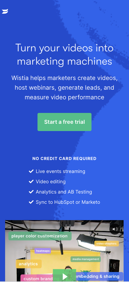
Mobile Landing Page Example #49. Wistia
Wistia’s mobile landing page focuses on getting users to use their video hosting platform. The page highlights the benefits of using Wistia for businesses and encourages users to sign up.
Why this landing page works well:
- Strong value proposition: The page emphasizes how Wistia helps businesses host and market their videos.
- Bold CTA: “Start a free trial” is prominently displayed, encouraging users to take action.
- Minimal design: The page avoids unnecessary distractions, focusing on the core benefits of the platform.
- Mobile-friendly layout: The page is responsive and designed for mobile users, ensuring a seamless experience.
Mobile Landing Page Example #50. Kajabi
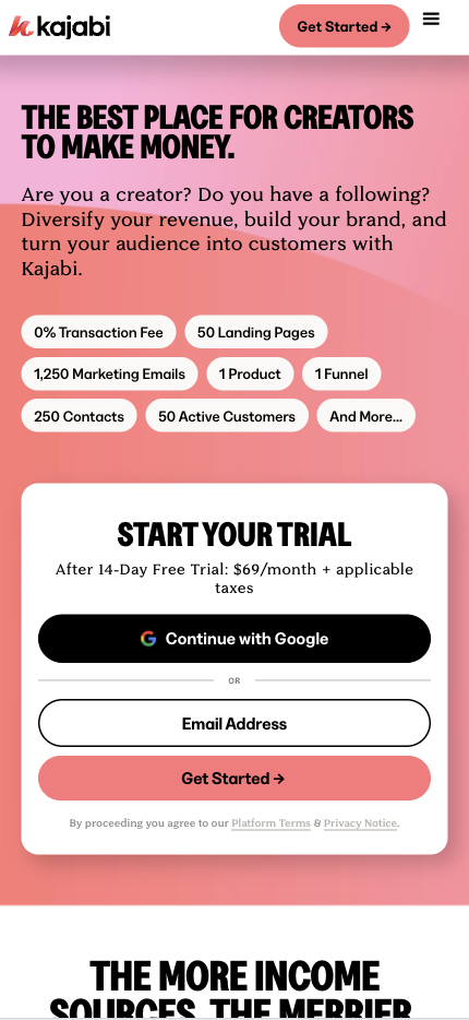
Kajabi’s mobile landing page focuses on helping users create and sell online courses. The page highlights the platform’s key benefits and encourages users to start a free trial.
Why this landing page works well:
- Clear value proposition: The page emphasizes how Kajabi helps users create, market, and sell online courses.
- Visual appeal: The page uses images of online courses to inspire users to start creating.
- Mobile-optimized layout: The page is responsive and designed for mobile devices, ensuring a seamless user experience.
Mobile Landing Page Example #51. Skillshare
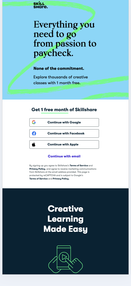
Skillshare’s mobile landing page, streamlined design, and compelling call to action highlight the platform’s focus on creative learning.
Why this landing page works well:
- Visually appealing: Skillshare uses high-quality images of courses and instructors to draw users in.
- Clear CTA: “Get 1 free month of Skillshare” is placed prominently, encouraging immediate action.
- Minimal copy: The page focuses on visuals and a short, impactful description of the platform’s benefits.
- Mobile optimization: The layout is responsive and easy to navigate on smaller screens, enhancing the user experience.
Mobile Landing Page Example #52. Grubhub
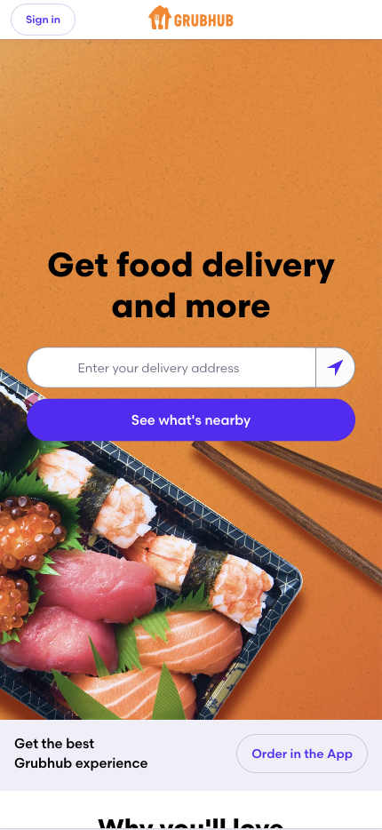
Grubhub’s mobile landing page simplifies food ordering by emphasizing convenience and ease of use.
Why this landing page works well:
- Immediate value proposition: “Get food delivery and more” is front and center, crystalizing the page’s purpose.
- Quick CTA: “See what’s nearby” invites users to act immediately, driving engagement.
- Location-based suggestions: Grubhub leverages mobile features to suggest restaurants nearby, personalizing the experience.
- Mobile-friendly design: The clean layout and quick loading times make for a smooth mobile experience.
Mobile Landing Page Example #53. Robinhood
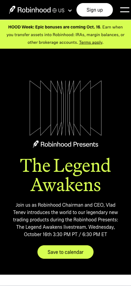
Robinhood’s mobile landing page is designed to attract users interested in commission-free stock trading. The design focuses on trust and simplicity.
Why this landing page works well:
- Bold, simple messaging: “The Legend Awakens” immediately tells users what differentiates Robinhood.
- Strong CTA: “Sign Up” is highlighted, driving users to act immediately.
- Visual simplicity: The minimalist design ensures that users focus on the core offer without distractions.
- Mobile optimization: The layout is clean and responsive, ensuring a seamless experience on any device.
Mobile Landing Page Example #54. Peloton
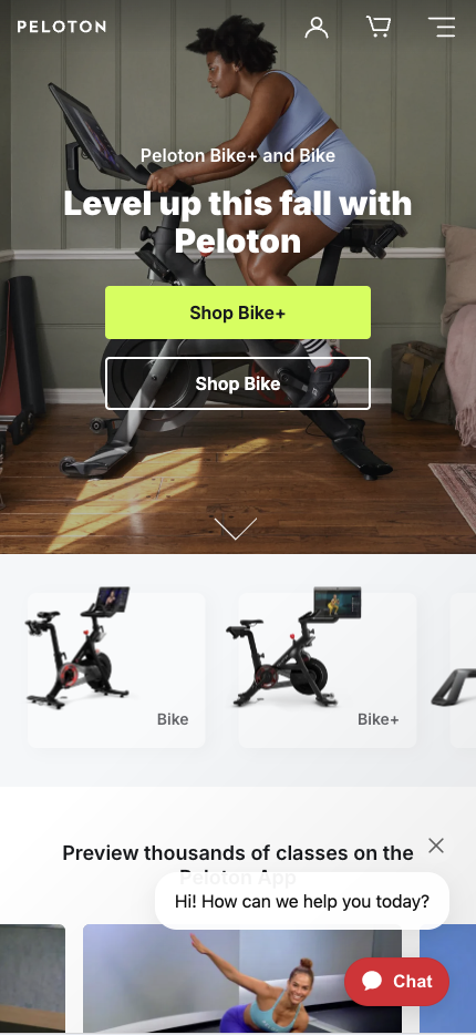
Peloton’s mobile landing page emphasizes its unique value proposition: offering a connected fitness experience from home. The design is focused on selling the product and getting users to engage.
Why this landing page works well:
- Engaging visuals: High-quality images and videos of their bikes and classes help showcase the product.
- Strong CTA: “Shop Bike” encourages users to act toward purchasing immediately.
- Clear benefits: The page highlights critical features of the Peloton bike, such as building desire and trust.
- Mobile-responsive: The layout adjusts seamlessly to mobile screens, ensuring a smooth user journey.
Mobile Landing Page Example #55. Venmo
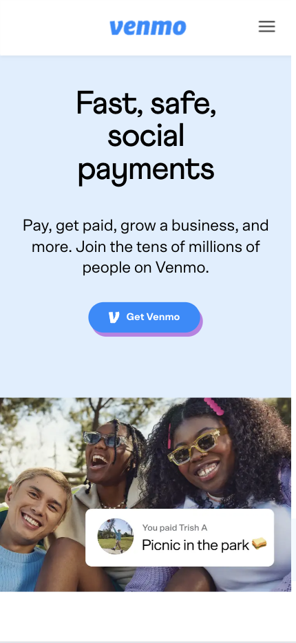
Venmo’s mobile landing page focuses on the simplicity and convenience of peer-to-peer payments. The design drives users to download the app and use Venmo for transactions.
Why this landing page works well:
- Focus on ease of use: “Fast, safe, social payments” immediately communicates the app’s primary benefit.
- Clear CTA: “Get Venmo” is front and center, encouraging users to start.
- Minimalist design: The page is free from distractions, focusing only on the core features.
- Mobile-first design: The layout and CTA buttons are optimized for mobile interaction, enhancing the user experience.
Mobile Landing Page Example #56. Tinder
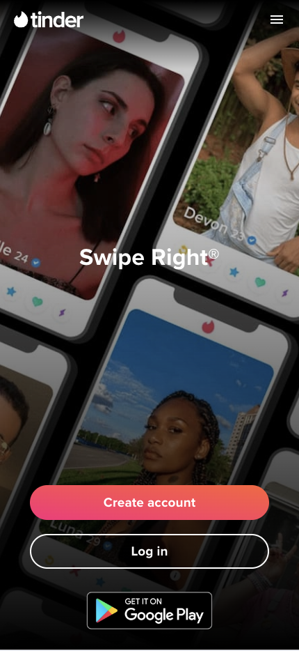
Tinder’s mobile landing page uses bold visuals and simple messaging to appeal to users interested in online dating. The design focuses on engagement and simplicity.
Why this landing page works well:
- Playful visuals: Bright colors and engaging images reflect Tinder’s brand and attract users.
- Simple CTA: “Create account” makes it easy for users to start immediately.
- Minimal copy: The page emphasizes visuals over text, making it easy to understand the offer.
- Mobile optimization: The layout is responsive and designed for quick engagement on mobile devices.
Mobile Landing Page Example #57. ClassPass
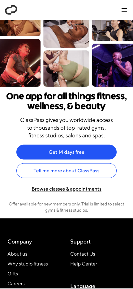
ClassPass’s mobile landing page focuses on its unique value proposition—access to multiple fitness studios with one membership. The design highlights the variety of classes available.
Why this landing page works well:
- Compelling offer: “Get 14 days free” invites users to sign up without commitment.
- Visual appeal: High-quality images of fitness studios and classes help users visualize the experience.
- Clear benefits: The page highlights the flexibility and variety that ClassPass offers, making it attractive to potential users.
- Mobile-responsive design: The layout adapts well to mobile, making navigation simple and easy.
Mobile Landing Page Example #58. Patreon
Patreon’s mobile landing page is designed to appeal to creators who want to monetize their work through fan support. The design highlights the platform’s value to artists and content creators.

Why this landing page works well:
- Strong value proposition: “Your wildest creative reality” speaks directly to the needs of creators.
- Clear CTA: “Get Started” invites creators to take action immediately.
- Minimalist design: The page focuses on the core message without overloading users with information.
- Mobile-friendly layout: The page is responsive and easy to navigate on mobile devices, ensuring a smooth user experience.
Mobile Landing Page Example #59. Everlane
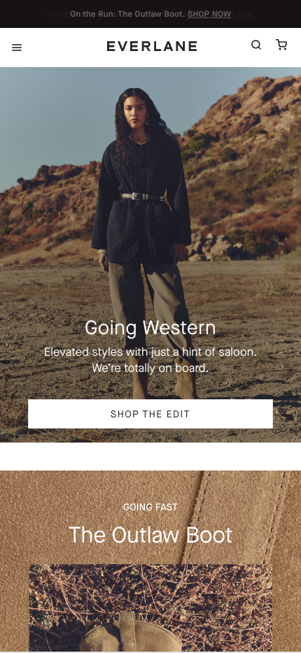
Everlane’s mobile landing page is designed to promote its sustainable fashion offerings, focusing on clean design and transparent messaging that resonates with conscious consumers.
Why this landing page works well:
- Clear value proposition: Everlane emphasizes ethical fashion, highlighting the brand’s transparency about pricing and production.
- Strong CTA: “SHOP THE EDIT” encourages users to explore the product line, driving immediate action.
- Minimalist design: The layout is clean and product-focused, helping users easily navigate the page.
- Mobile optimization: The mobile-responsive design ensures a seamless shopping experience, with fast loading times and intuitive navigation.
Mobile Landing Page Example #60. Fiverr
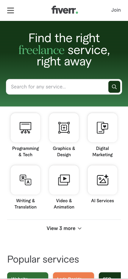
Fiverr’s mobile landing page emphasizes the platform’s wide range of services and affordable pricing. The design is simple, making it easy for users to start browsing services.
Why this landing page works well:
- Clear value proposition: “Find the right freelance service, right away” directly appeals to Fiverr’s target audience.
- Strong CTA: “Join” encourages users to sign up and explore the platform.
- Easy navigation: Users can browse services easily thanks to a simple, mobile-friendly layout.
- Visual appeal: The page uses engaging images of freelancers and their work to inspire users.
Mobile Landing Page Example #61. Vimeo
Vimeo’s mobile landing page focuses on its video hosting service, appealing to creatives and businesses alike. The design emphasizes the platform’s quality and professionalism.

Why this landing page works well:
- Clear messaging: “Do more with video” outlines Vimeo’s key benefits.
- Strong CTA: “Join for free” encourages users to sign up and explore Vimeo’s features.
- Minimal design: The page is clean and easy to navigate without distractions.
- Mobile-optimized layout: Vimeo’s landing page is responsive and designed for easy interaction on mobile devices.
Mobile Landing Page Example #62. TripAdvisor
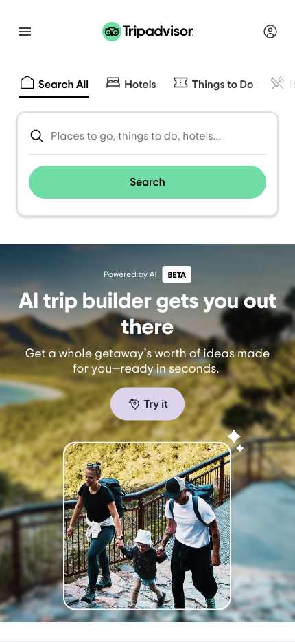
TripAdvisor’s mobile landing page helps users quickly and easily find travel accommodations. The simple layout focuses on the primary goal of booking a hotel.
Why this landing page works well:
- Easy search functionality: The search bar is prominently placed, allowing users to search for hotels immediately.
- Minimal design: The page focuses on functionality, with a clear layout emphasizing user-friendly navigation.
- Mobile-responsive design: The page is designed to be easy to use on mobile devices, making the booking process simple.
Mobile Landing Page Example #63. Shutterstock
Shutterstock’s mobile landing page highlights its vast library of stock images. The simple design allows users to explore the platform quickly and easily.

Why this landing page works well:
- Strong value proposition: The page emphasizes the size and quality of Shutterstock’s image library.
- Clear CTA: “Get this deal for a limited time” invites users to test the platform without commitment.
- Minimal design: The page avoids unnecessary distractions, focusing on the platform’s core offer.
- Mobile-friendly layout: The layout is responsive and designed for seamless navigation on mobile devices.
Mobile Landing Page Example #64. Glossier
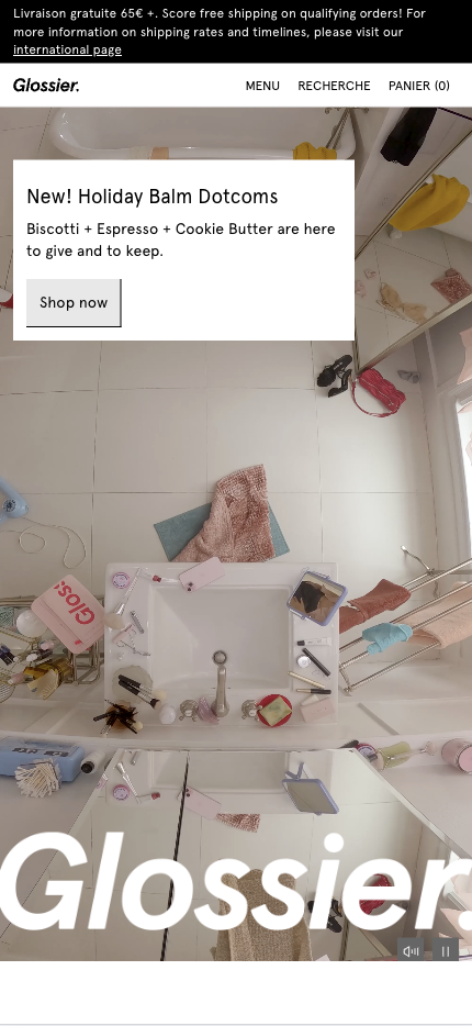
Glossier’s mobile landing page is designed to appeal to beauty enthusiasts, focusing on minimalist design and highlighting their most popular products.
Why this landing page works well:
- Visually engaging: Glossier uses high-quality product images to capture users’ attention and showcase the products.
- Strong CTA: “Shop Now” is prominently placed, making it easy for users to start browsing immediately.
- Mobile-optimized layout: The page is designed for a smooth mobile experience, with fast loading times and easy navigation for shoppers.
Mobile Landing Page Example #65. UberEats
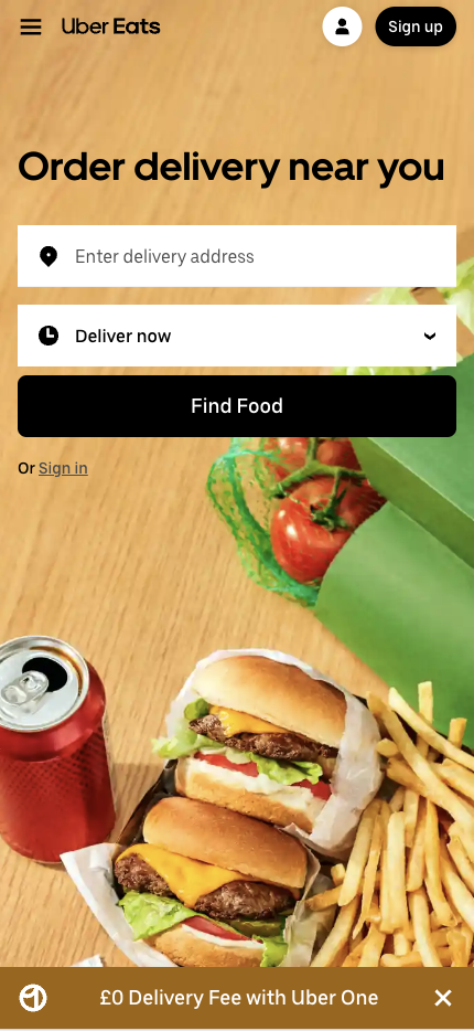
UberEats’ mobile landing page is designed to simplify ordering food. The layout emphasizes speed and convenience, encouraging users to place orders quickly.
Why this landing page works well:
- Strong value proposition: “Order delivery near you” clearly communicates the page’s purpose.
- Immediate CTA: “Find Food” encourages users to take action without hesitation.
- Simple navigation: The layout lets users quickly search for restaurants or food options.
- Mobile-first design: The page is optimized for mobile, making the food ordering process quick and easy.
Mobile Landing Page Example #66. ZoomInfo
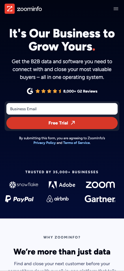
ZoomInfo’s mobile landing page focuses on helping businesses generate leads and close deals with access to its extensive database. The design highlights the platform’s core benefits.
Why this landing page works well:
- Clear value proposition: The page emphasizes how ZoomInfo helps businesses grow by providing access to accurate contact data.
- Bold CTA: “Free Trial” invites users to explore the platform’s capabilities.
- Minimal distractions: The design focuses on the primary offer, with no unnecessary elements.
- Mobile-optimized layout: The layout is responsive and easy to navigate, ensuring a smooth user experience.
Mobile Landing Page Example #67. Freshdesk
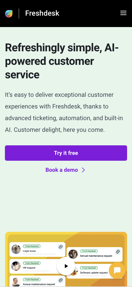
Freshdesk’s mobile landing page attracts businesses looking for customer support software. The design focuses on simplicity and ease of use, with a clear call to action.
Why this landing page works well:
- Strong value proposition: The page highlights how Freshdesk simplifies business customer support.
- Bold CTA: “Try it free” is prominently displayed, encouraging users to engage.
- Minimal design: The layout is clean and focused, making it easy for users to find the CTA.
- Mobile-friendly design: The page is responsive, ensuring a smooth experience on mobile devices.
Mobile Landing Page Example #68. Teachable
Teachable’s mobile landing page highlights its platform for creating and selling online courses. The design emphasizes ease of use and encourages users to start creating immediately.

Why this landing page works well:
- Clear value proposition: The page focuses on how Teachable helps users create and sell courses quickly.
- Strong CTA: “Start for free” is prominently displayed, encouraging users to take immediate action.
- Visual appeal: The page uses images of successful courses to inspire users.
- Mobile-optimized layout: The layout is responsive, making it easy to navigate on mobile devices.
Mobile Landing Page Example #69. Instacart
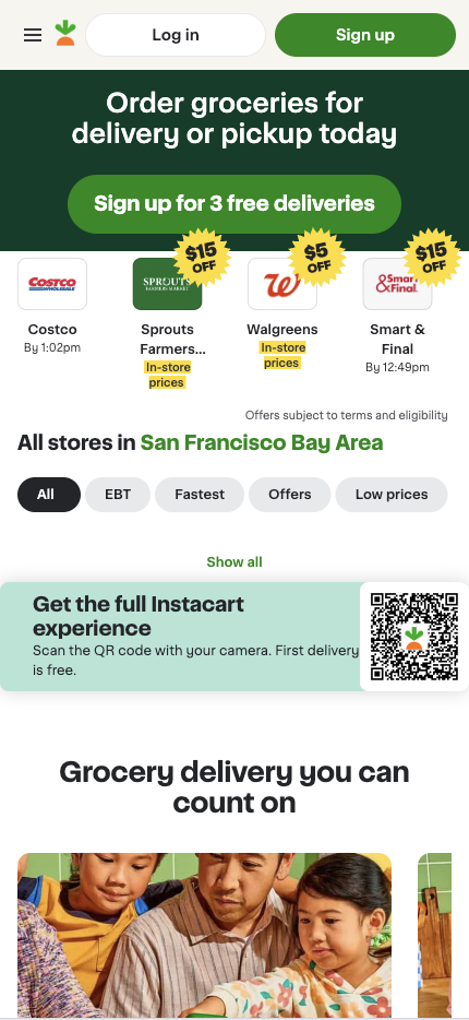
Instacart’s mobile landing page focuses on convenience in grocery delivery. The design emphasizes speed and ease, making it easy for users to place orders.
Why this landing page works well:
- Immediate value proposition: “Order groceries for delivery or pickup today” clearly communicates the page’s purpose.
- Simple CTA: “Sign up for 3 free deliveries” encourages users to begin their grocery shopping.
- Minimal distractions: The layout is clean and focused on the main offer.
- Mobile optimization: The page is designed for mobile devices, ensuring a smooth and fast user experience.
Mobile Landing Page Example #70. Duolingo
Duolingo’s mobile landing page is designed to attract language learners with its easy-to-use app. The focus is on simplicity and a playful design that appeals to severe and casual learners.

Why this landing page works well:
- Clear value proposition: Duolingo emphasizes “The free, fun, and effective way to learn a language!” instantly drawing users in with a strong, straightforward offer.
- Playful visuals: Bright colors and engaging images reflect Duolingo’s fun, gamified learning experience.
- Strong CTA: “GET STARTED” urges users to sign up and begin learning without upfront cost or commitment.
- Mobile-optimized design: The responsive layout ensures that users can easily navigate and interact with the app on any mobile device.
Mobile Landing Page Example #71. Dropbox Sign
Dropbox Sign’s mobile landing page emphasizes the simplicity of its e-signature tool, targeting users who need an efficient solution for signing documents digitally.
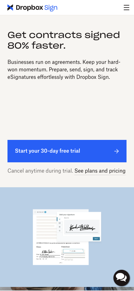
Why this landing page works well:
- Clear value proposition: The messaging focuses on “Simple, secure eSignatures” to attract users who need a fast solution.
- Bold CTA: “Start your 30-day free trial” stands out, encouraging users to start without hesitation.
- Minimalist design: The clean layout focuses on a single action, making the process straightforward.
- Mobile-friendly experience: The page is optimized for mobile users, ensuring they can quickly sign up and use the service.
Mobile Landing Page Example #72. Tidal
Tidal’s mobile landing page is designed to attract music lovers by offering high-quality sound and exclusive content. The sleek and modern design aligns with the brand’s image as a premium music streaming service.
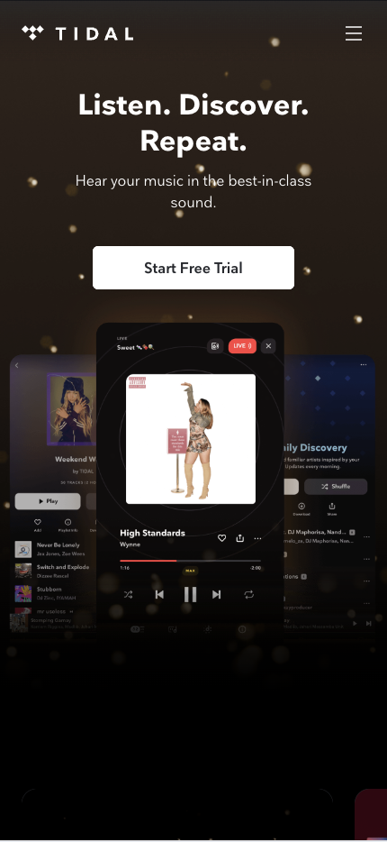
Why this landing page works well:
- Clear value proposition: Tidal emphasizes “Listen. Discover. Repeat.” appealing to audiophiles and music enthusiasts.
- Visually appealing: The landing page uses dark backgrounds and high-quality visuals of artists and concerts, creating an immersive and premium feel.
- Strong CTA: “Start Free Trial” is bold and encourages users to explore the service risk-free, driving immediate engagement.
- Mobile-optimized experience: The page is responsive and designed for mobile devices, ensuring seamless navigation and quick load times.
Mobile Landing Page Example #73. Pluralsight
Pluralsight’s mobile landing page targets learners and professionals seeking to develop new skills. The design highlights the platform’s extensive course library and encourages users to start a free trial.

Why this landing page works well:
- Strong value proposition: The page emphasizes learning and skill development, which resonates with its target audience.
- Bold CTA: “Save now” encourages users to explore the platform without an initial commitment.
- Minimal distractions: The clean design makes it easy for users to focus on the platform’s core offering.
- Mobile-first layout: The page is fully responsive, ensuring an optimal experience on mobile devices.
Mobile Landing Page Example #74. Asos
Asos’ mobile landing page is designed to attract fashion shoppers with its sleek design and easy navigation. The page focuses on promoting the latest trends and driving immediate purchases.
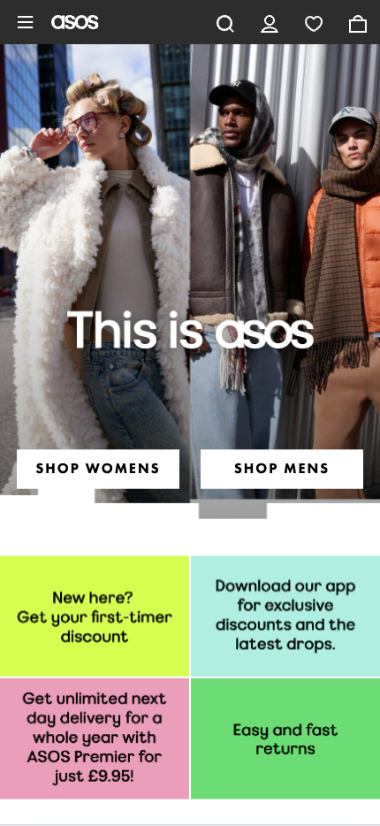
Why this landing page works well:
- Clear value proposition: Asos emphasizes “This is asos” with visuals that showcase its newest collections, appealing directly to fashion-conscious users.
- Strong visuals: The landing page uses high-quality images of clothing and accessories to capture the user’s attention and inspire purchases.
- Bold CTA: The prominently displayed “SHOP WOMENS” and “SHOP MENS” make it easy for users to browse immediately.
- Mobile-optimized design: The layout is clean and easy to navigate, with fast loading times, ensuring a smooth shopping experience on any mobile device.
Mobile Landing Page Example #75. Kickstarter
Asos’ mobile landing page attracts fashion shoppers with its sleek design and easy navigation. The page promotes the latest trends and drives immediate purchases.
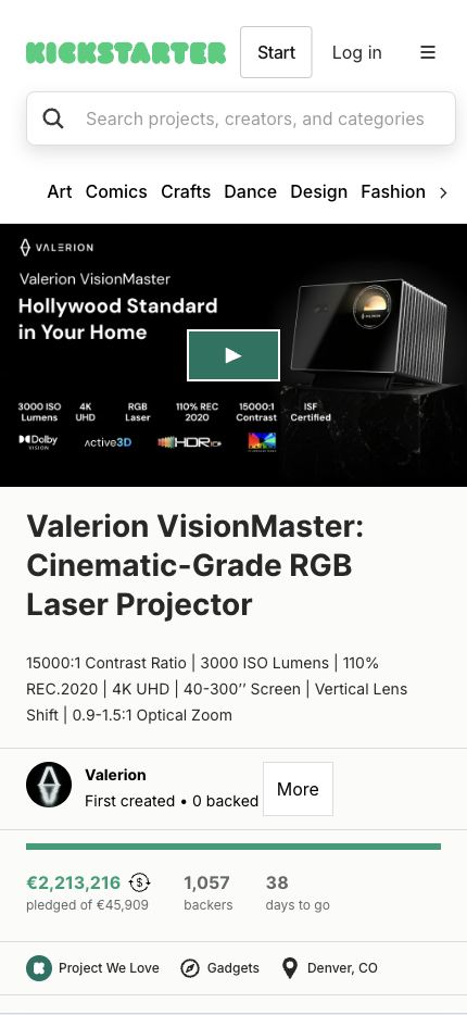
Why this landing page works well:
- Strong CTA: “Start” encourages immediate action, making launching a project easy and accessible.
- Visual storytelling: Captivating visuals highlight successful projects, encouraging users to get involved.
- Mobile-responsive design: Kickstarter’s layout is mobile-friendly, making it easy for users to start projects or browse others.
Conclusion
Creating a successful mobile landing page is more than just a good-looking design; it’s about providing a seamless user experience that drives conversions. Whether you’re looking to drive sign-ups, boost sales, or engage users, a clear value proposition, a strong call to action, and minimal distractions are key. Mobile landing pages should offer a seamless experience, with fast loading times and responsive design, ensuring visitors can easily interact with your content. In fact, 53% of mobile users will leave a site if it takes longer than 3 seconds to load, making speed optimization crucial to your success.
If you’re ready to take your landing pages to the next level, consider using Wishpond’s landing page builder. Wishpond makes creating mobile-friendly, high-converting landing pages easy with its drag-and-drop interface and built-in analytics.
For more tips and best practices on creating compelling mobile landing pages, read this article from Wishpond and discover how to build even better mobile landing pages.
Ready to build high-converting mobile landing pages for your business? Book a free VIP demo with Wishpond and see how their platform can help you create landing pages that engage and convert your mobile visitors into loyal customers.
FAQs
1. What should I focus on when creating a mobile landing page?
Focus on delivering a clear, concise value proposition, a strong call to action, and a fully optimized design for mobile devices. Your landing page should load quickly, look stunning on smaller screens, and drive users to act immediately.
2. How can I improve the conversion rate of my mobile landing page?
Use clear, action-driven CTAs to boost conversions. Keep the design simple and fully optimize your page for mobile. Offer a free trial or exclusive discount to motivate users to sign up or purchase.
3. What tools can I use to create mobile landing pages?
Wishpond is a powerful platform for creating mobile-responsive landing pages quickly and easily. Its drag-and-drop interface and built-in analytics make developing and optimizing landing pages for maximum conversions effortless.
4. Why is mobile optimization important for landing pages?
Mobile optimization is crucial because over half of all web traffic comes from mobile devices. A mobile-optimized landing page ensures a seamless user experience, which can drive conversions and reduce bounce rates.
5. How do I track the success of my mobile landing pages?
Use analytics tools to track key performance indicators (KPIs) such as conversion rates, bounce rates, and time on page. Wishpond offers built-in analytics to help you monitor and optimize your landing pages for the best results.
