B2B
Get New Free Trials
Description
The Free Trial Signup Page Campaign is modeled on Intercom’s own free trial sign up campaign. It uses the same Campaign steps and persuasive techniques to get new free trial signups.
The Free Trial Signup Page Campaign is a powerful way to get new free trial for your B2B solution. People sign up to get trial access to your solution for a limited time. It’s an easy way to get new customers who are comparing solutions – they can try out your solution to see that it meets all of their needs and wants first-hand.
Step 1: Google Adwords Ad
Advertise to people when they search for your B2B solution to drive them to your Free Trial Signup Page.

Step 2: Free Trial Signup Page
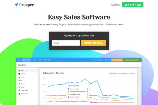
On this page, people learn about your B2B solution and enter their email. This makes the first step to sign up quick and easy.

Step 3: Account Creation Page
After people sign up on the Free Trial Sign up Page, they’re taken to the Account Creation Page in your app to create an account and start their free trial.
Step 1: Google Adwords Ad
Google Adwords Ads make it easy for you to promote your B2B solution to people when they search for it on Google.
This is a pre-built Google Adwords Ad that we’ve used for our own B2B solution:
-
1. Ad
1Easy Landing Page Builder – Signup for a 14-Day Free Trial
2www.yoursite.com/free-trial 1-800-921-016734
Wishpond’s Drag-and-Drop Builder makes it easy to create beautiful landing pages.
1. Headline
In the first part of the Headline, show text that the person is likely to have entered in their Google search. This will make them feel like the Ad is personally relevant to them, and make it more likely that they’ll click. In the second part of the Headline, Signup for a 14-Day Free Trial, show a call-to-action. This tells people exactly what they will get when they click on the Ad, making it more likely for them to do so.
2. Display URL Path
The best thing to have in the Display URL Path is the keyword that the person entered on Google. This will make it super relevant for them, as it uses the exact words they were thinking of. You can do this using Keyword Insertion. In the Google Adwords builder, enter {keyword:free-trial} into the Display Path field. This will make the Display Path show the keyword that the person searched for, or show free-trial if Google can’t display the keyword.
3. Call Extension
Use the Call Extension to add your phone number to your Ad. This way, people can call you directly by clicking the Ad, which is especially useful for people who see your Ad while using their mobile phone.
4. Description
Describe your solution in 1-2 short sentences.
-
2. Keywords
Top Keywords to Target:
- +landing
- +page
- +builder
This keyword targets people who are searching for landing page builders. It uses broad match modifiers for +landing +page +builder to target people who are specifically searching for landing page builders.
Note: This keyword is just a starting point. For best results you should experiment with it and try similar variations.
Why are Google Adwords Ads effective for this Campaign?
The reason they’re effective is because they’re shown to people at the moment they’re asking Google for information about your solution. This, of course, means that they’re interested in purchasing your solution. So you’re able to show your Ad exclusively to an audience of people that are interested in what you offer, which is the most effective way to advertise.
Need Help with Google Adwords?
Step 2: Booking Page
The Free Trial signup page acts as a stepping stone to get people to sign up for a free trial. On it, people are shown the features and benefits of your solution are only asked for their email address to sign up. This makes the sign up process seem easy – so many people will enter their email address right away. You can then take the visitors to your app’s full sign up page, where you may ask for a lot more information, including their billing information.
People are much more likely to finish something if they have already made progress to complete it. By asking just for email first, you’ll get more people started down the funnel to start a free trial – and more of them will finish the sign up process than if you asked for their billing information right away.
-
1. Get visitors to enter their email:
The page’s main job is to convince people to enter their email into the form. It does this first by making it easy – by showing the email signup form at the top of the page.
The page is filled with several sections to convince them to sign up for a free trial:
- It tells visitors what your value proposition is right at the top
- It shows a large screenshot of your app to get people excited to try it out
- It has a section to showcase the features of your solution.
- And it has a client testimonial.
-
2. Pre-qualify them to become customers:
The page also highlights the top features of your solution. And by saying “Yes, I want a free trial” they’re pre-qualifying themselves to trust you and buy your full solution.
Landing Page Sections


1. Top Bar
Show your logo and phone number at the top so people can call you right from the page.
2. Hero Unit
- HeadlineTell people what your main value proposition is.
- SubtextThe subtext describes your solution and how it can help their business in 1-2 sentences.
- SubheadlineThis tells people what to do: Fill out the sign up form to get a free trial.
3. App Screenshot
Show a screenshot of your app so that people can get an inside look.
4. Features
Highlight the most important features of your solution to get visitors excited to sign up for a free trial. This shows your features in a visual layout that makes it easy to scan and find the features that are most important to them.
5. Client Testimonial
Display the social proof of the value of your solution with a customer testimonial. This builds trust and makes people feel comfortable signing up for a free trial.
How to Create this Campaign in Wishpond
The Free Trial Signup Page Campaign is available for free on any plan in Wishpond. Here’s how to use it:
- Sign up for a Wishpond account.
- Select B2B as your Industry
- In the Campaigns Dashboard, click on Free Trial Signup Page.
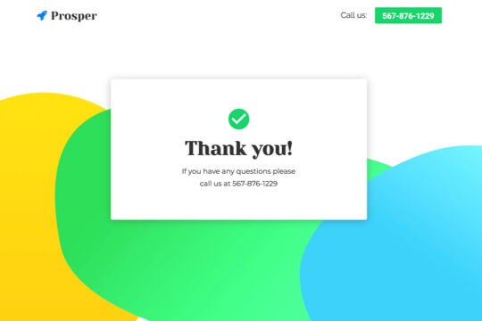
- This will take you to the Campaign Builder where you can edit the Free Trial Sign Up Page and Thank You Page. They’ll look just the same as they do above, and you’ll be able to edit and style them however you want.
- Publish your Campaign to your website or a wishpond.com URL.
- Create your Google Ad and set the Ad’s Destination URL to the Campaign URL.