[content-section top=”9″ bottom=”9″]
Landing Pages for Small Business
When someone arrives on your website, what do you want them to do there? Just learn about who you are? Just find out your address? Just check out your menu?
No.
You want them to do something. Complete an action.
Or at least you should. Your homepage isn’t just a place to educate your prospective customers. It’s a place to encourage them to buy, book, register, become a member, become a lead.
After all, why have you spent all that money and energy on generating traffic – social media, SEO, Facebook Ads and Google Adwords – if your website isn’t ready to receive them?
This is where landing pages come in.
A landing page is a page within your website devoted to getting a conversion. It’s focused on a single goal, and optimized to achieve that goal as frequently as possible from your site visitors.
This article will break down the three primary types of landing pages your small business will find useful. If your business isn’t in the business of lead generation, feel free to skip that section and head straight to landing pages for booking, reservation or contact and work down from there:
- Landing pages for lead generation
- Landing pages for booking, reservation or contact
- Homepage landing pages
I’ll give examples of each then provide an optimization checklist to better utilize the website traffic you get.
Let’s get rolling!
Landing Pages for Lead Generation
What is a lead?
A lead is anyone who’s provided you with contact information but not yet bought from you.
There are a few kinds of leads…
- Lead: Generic term for somebody whose contact information you have but who has not yet bought.
- Blog subscribers: These are people who have provided an email address, but only to receive your blog articles. They may only vaguely know what your company does.
- Marketing-Qualified Leads (MQLs): A MQL is a lead who has shown interest in your product or service (or at least the solution you provide).
- Sales-Qualified Leads (SQLs): MQLs become SQLs when they show intent to buy.
But we’re getting ahead of ourselves. Let’s drop back a bit.
Why would you generate leads?
Many small businesses generate leads because their sales funnel is more complicated than “I like that T-shirt. I’m going to buy that T-shirt.”
Instead, it starts with someone saying to themselves “Everybody seems so quiet at my company. I need to improve inter-office communication, but I have no idea what that might entail.”
The answer might be your business, but they don’t know that yet.
So they type something into Google, perhaps “improve employee engagement,” and because you’ve optimized for SEO your business blog pops up on the first page.
They learn something in the blog and decide to download your “Complete Guide to Improving Employee Engagement.” That guide is lead, or email, gated. Downloading it requires them to provide their email address. And once they do you can start communicating with them via email and turn them in the direction of a free trial or sales call.
How do I generate leads?
- Email-gated content (ebooks, webinars, content upgrades, infographics, case studies, videos, etc) – “Want a complete resource on a subject you’re interested in? Provide your email address and get access!”
- Blog subscription – “Want to receive our next awesome blog article straight to your inbox? Provide your email address and be subscribed!”
- Contests and promotions: “Want a chance to win something you’re interested in? Provide your email address and enter for a chance to win!”
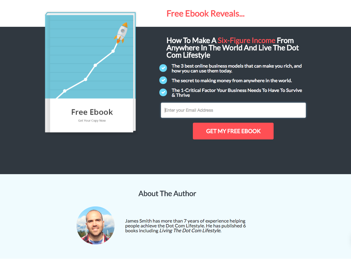
Here’s one of Wishpond’s ready-to-go lead generation landing page templates:

Landing Pages for Booking, Contact or Demo
Many small businesses don’t need to generate leads. Your sales funnel isn’t that complicated or you don’t get enough traffic that you have to start automating your communication.
* That said, even if you can handle the numbers you’re getting, you might be surprised by the effectiveness of a few automatic educational emails sent to people who submit lead information. You might close more if you put a delay on the sales call.
But you still need your website visitors to take an action. You still want a phone number. You still want them to reach out and book a table or request a time to talk.
These are conversion goals. And if you want to get the most out of your website you need to optimize with them in mind.
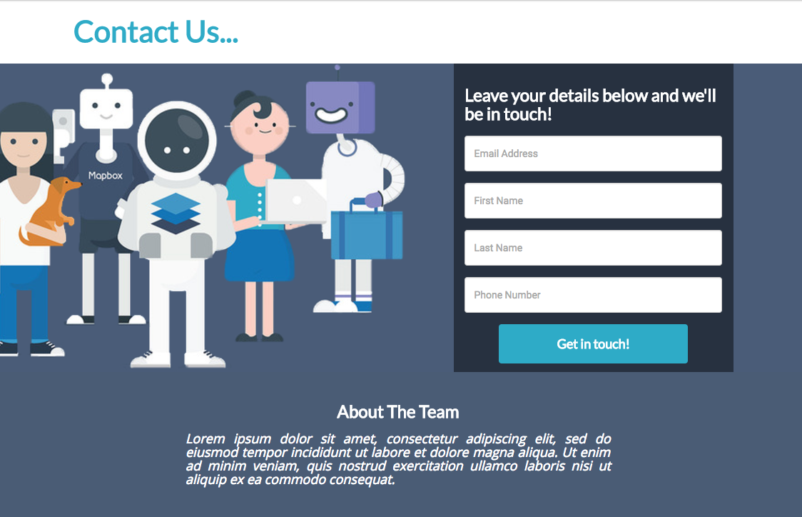
It can be simple, from optimizing your “Contact Us” Page…

To booking a property evaluation, registering for a chiropractor appointment, submitting a job application, starting a free trial, booking a product demo, requesting a call-back, and every other element of your small business which requires the submission of contact information.
Homepage Landing Pages
It’s likely that your homepage is the highest traffic page of your website. It’s the gateway, you might think, to your more-specific pages.
Except you’re wasting traffic.
It’s all about bounce rates. Your website’s bounce rate is the percent of people who visit one page of your site and don’t continue to another.
You’re not maximizing your traffic if you don’t optimize the first page they arrive on. If you just think of it as a directory of links to the pages you care about, you’ll lose a sizeable percentage just in the bounce rate.
Instead, let’s consider your homepage to be a landing page all on its own – a page devoted to a single conversion.
You can keep the navigation bar, but a lot has to change…
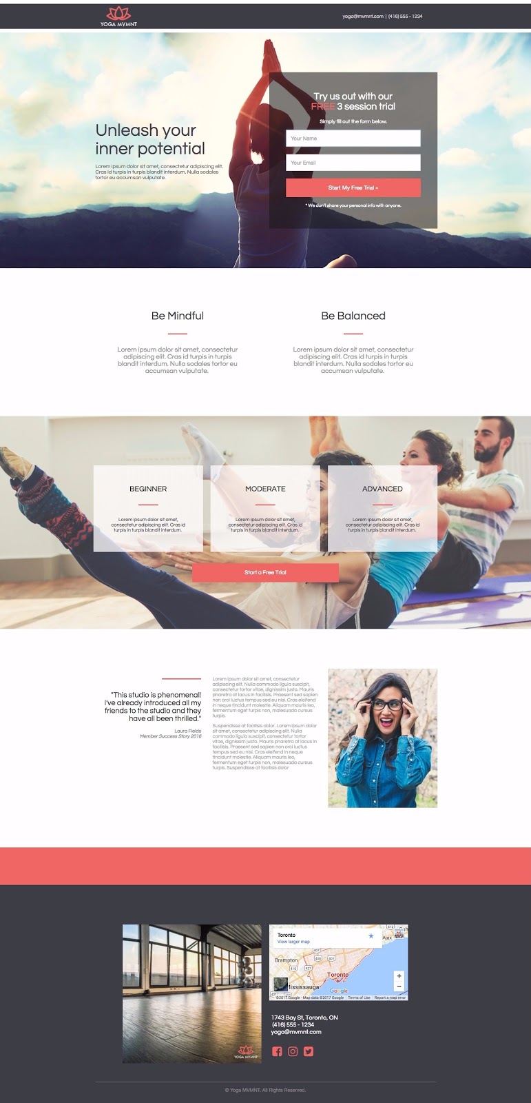
Here’s another template example, this time from a yoga studio homepage:

This page is a cross between a landing page and a homepage. It still provides information like location and product packages, but (despite two call-to-action buttons) there’s only a single conversion goal: Start your 3-Session Trial.
This landing homepage has…
- A value proposition headline: “Unleash your inner potential” as well as the logo and brandname
- A simple, above-the-fold, two-field form with a straightforward and clear “ask” telling visitors what they get and what they’re submitting information for
- “More Information” in the form of three classes, two paragraphs (where you’d communicate more value), an image, the address, and a map
- A customer testimonial with specific benefit points and a name and headshot
- A phone number and contact details: This is crucial for SEO as well as user experience
- A second, below-the-fold call-to-action which is internally linked to the top form.
For more on optimizing your homepage as a landing page, check out “Homepages are Dead: The Rise of the All Landing Page Website.“
An Optimization Checklist For Your Small Business Landing Page
- I’ve chosen a landing page color scheme which contrasts and is visually appealing.
- My landing page’s elements (form, headline, copy) is spread out, delineated, and nothing is cluttered.
- My page is simple enough, my copy large enough, and everything is easy to understand. My page passes the 5-second test.
- The landing page elements I want people to focus on are surrounded by whitespace or blank space to set them off.
- There are no links except those which are absolutely necessary. I know that any distractions will reduce conversion rates.
- I’ve used directional cues (arrows, lines, eye-direction, etc) to direct my visitor’s attention to my landing page’s focus points.
- My headline is clear, communicates value and isn’t too vague.
- My landing page call to action looks like a button (not a link), contrasts visually, is above-the-fold and the copy reads as something desirable (not “submit”).
- If applicable, I’ve added urgency to my landing page with text or a countdown timer.
- My page’s testimonials or reviews say who they’re from and include a headshot.
- My page’s testimonials are believable and provide further information/value to visitors.
- My landing page’s form only asks for information from visitors I’m actually going to use to convert them into a sale.
- My landing page copy discusses benefits, not features.
- I’ve proofread my landing page fully.
For more optimization tips and more on a few of these points, check out…
- The Last Landing Page CRO Checklist You’ll Ever Need
- 5 Ways You Can Create Urgency on Your Landing Page
- The Most Significant Information You Need to Get from Leads
- 7 Landing Page Call-to-Action Formulas for Higher Conversions
- How to Use Directional Cues to Optimize Landing Page Conversion
- Landing Page Customer Reviews: The How the What and the Wherefore
- The Data-Driven Guide to Landing Page Design (with Infographic)
Wrapping it Up
Hopefully this introduction to landing pages will help your small business understand and justify the investment.
Without landing pages, your website is a passive one. People come, and they go, and you don’t have much involvement. You’re just sitting there, waiting for them to make the decision you want them to.
But through landing pages and conversion optimization, you have a say. You can influence, encourage, and (especially with popups) really impact their decisions.
Related Reading:
[/content-section]
[contentblock id=backtoindex]